Case studies / TPO Mobile
TPO Mobile
- Discipline
- UX and UI design
- My role
- Head of Design and UX
- Timeframe
- 2015 to 2016
01 Summary
How do you launch a phone network and brand in New York?
In mid 2015 I moved my focus as Head of Design and UX to TPO's 2016 US launch. The goal was to rival other prepaid networks, with 10% of every bill going to a cause the customer chose.
No website
and no brand, in a market that worked completely differently.
02 The problem
A new market, from a standing start.
There was no website and no brand. Plans worked completely differently in the US: customers rarely dealt with SIM cards and could switch providers freely, so loyalty had to be earned. A third party handled switch on and data, and its journey and payment gateways had to feel seamless. My job was to make it so.
03 The process
Complex telecoms, simple journeys.
Four steps from a blank page to a US launch.
01
Go to New York
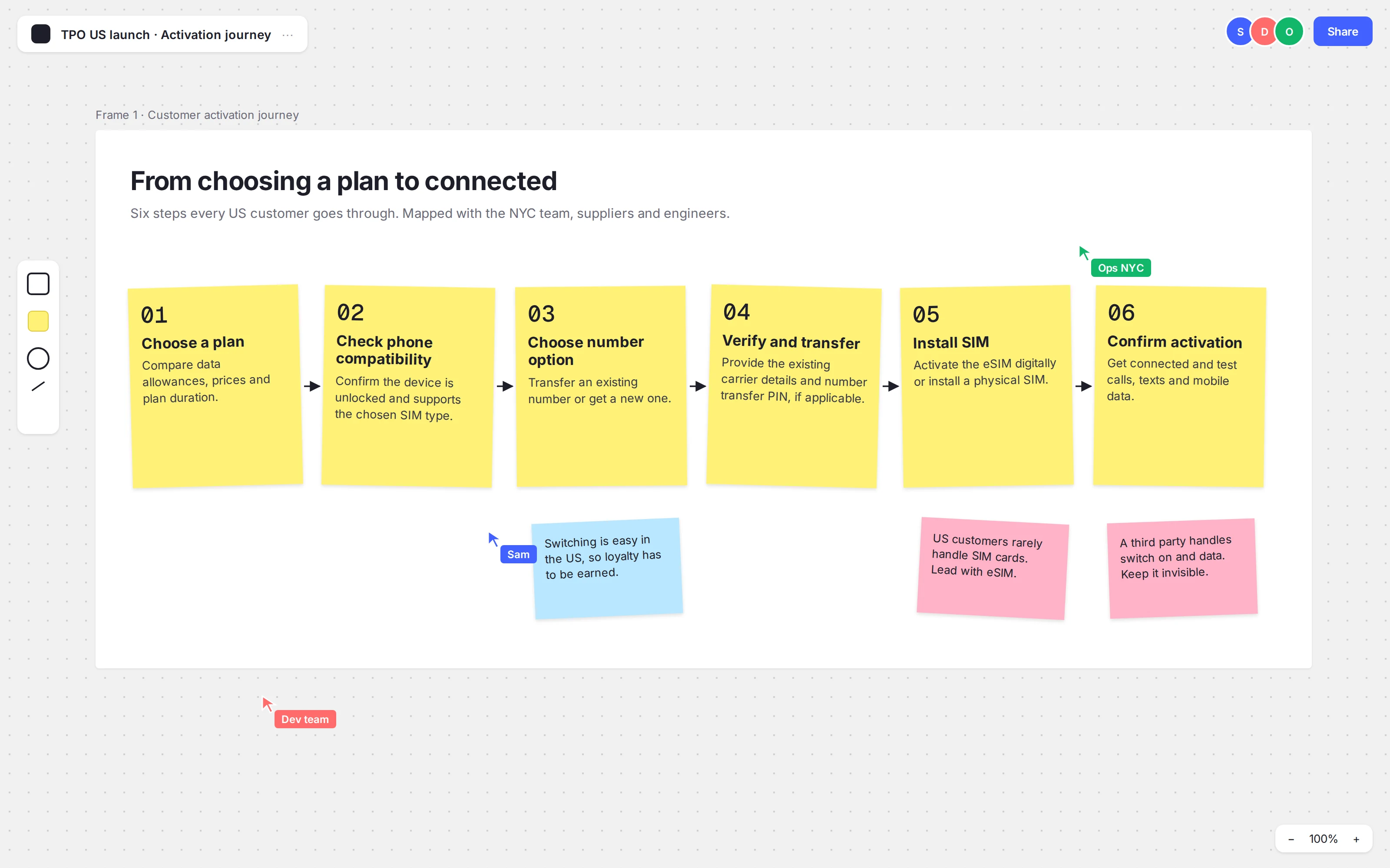
I spent time with the NYC team to understand how US customers choose plans. Then we mapped the six step activation journey, from choosing a plan to getting connected.
01 · Go to New York · the activation journey 02
Flows first
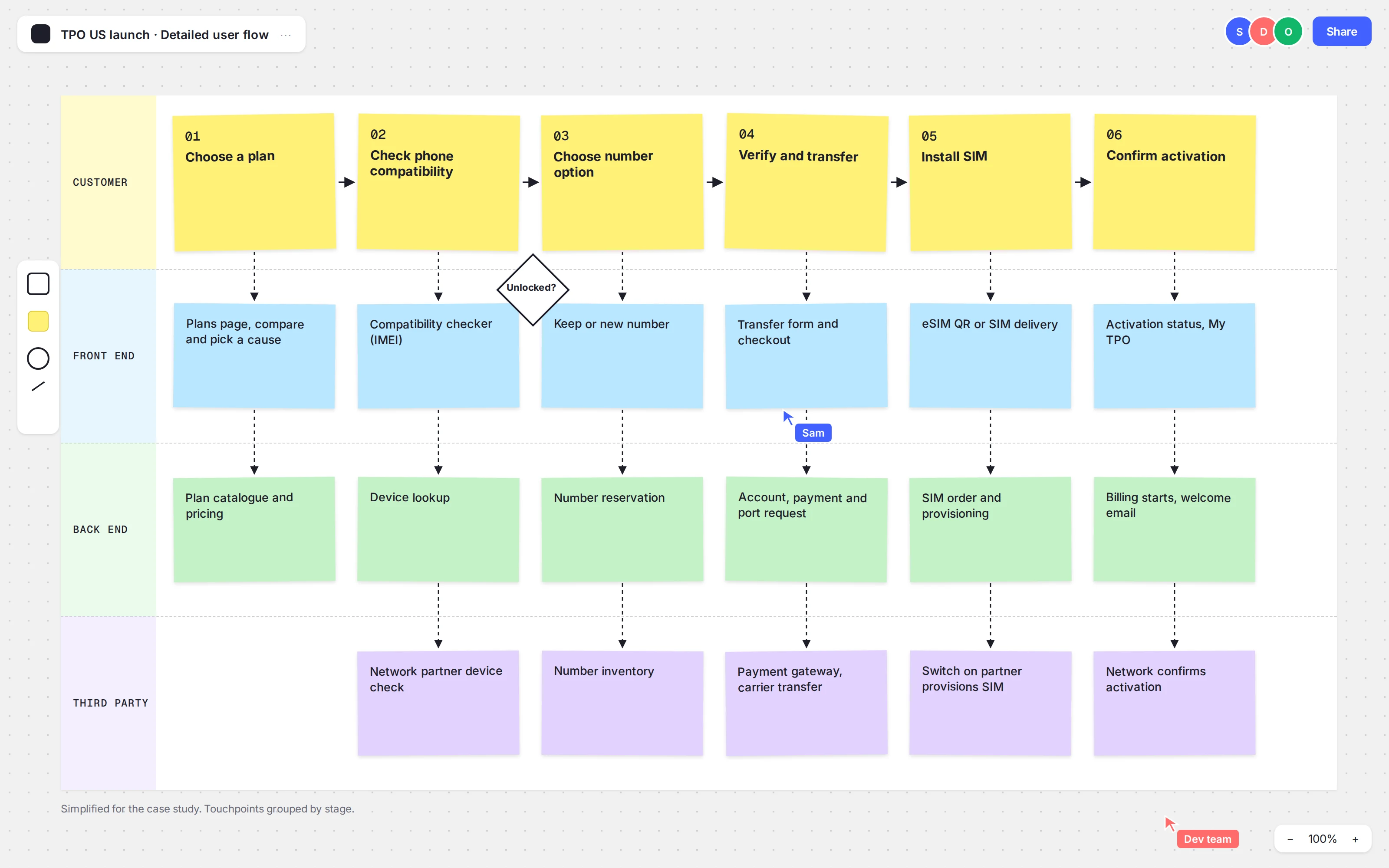
We traced every front and back end touchpoint, from the plans page to the switch on partner. Developers, product owners and suppliers reviewed each flow with me.
02 · Flows first · front and back end touchpoints 03
Make it one service
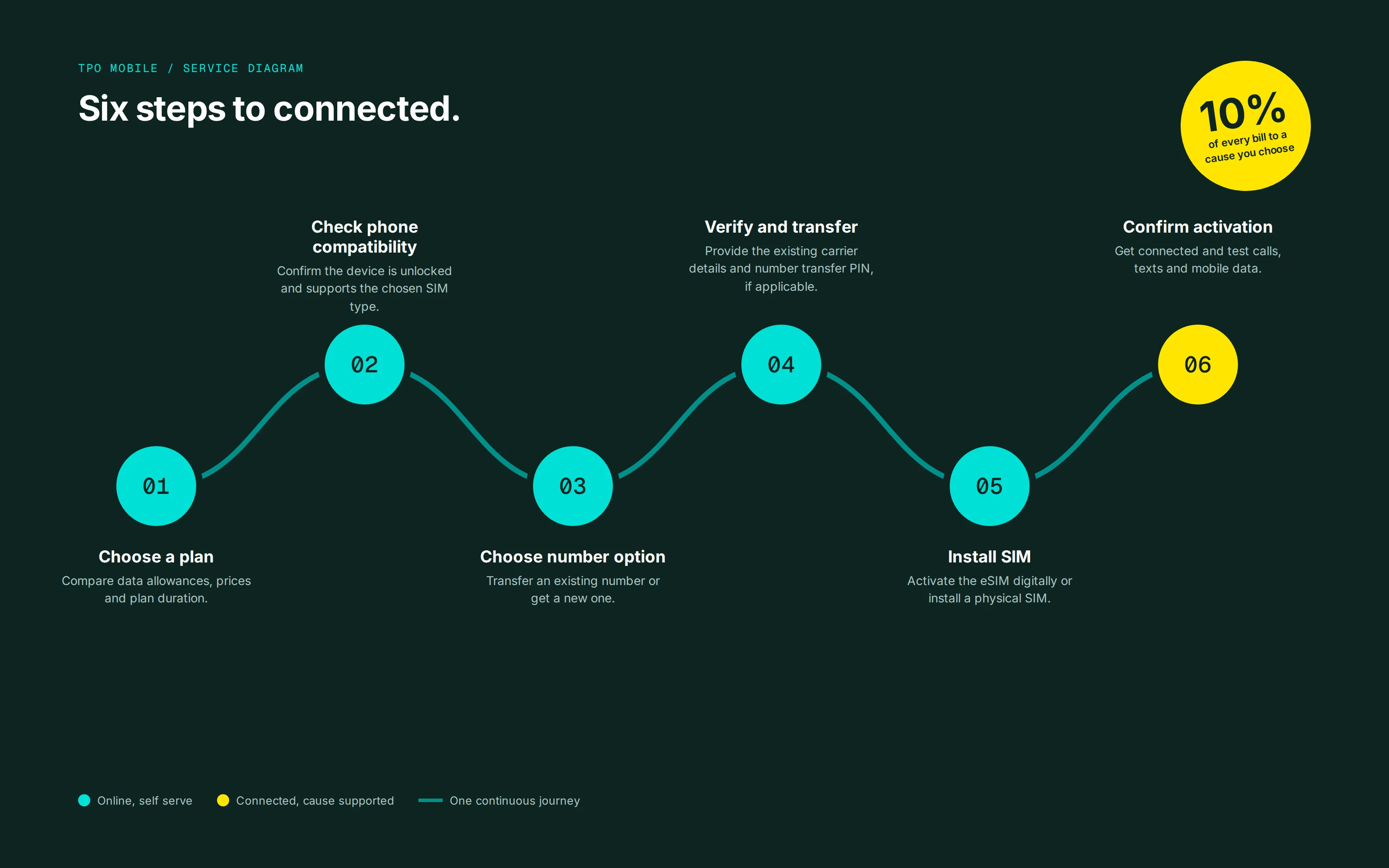
Studying US competitors showed us how the market really worked. We turned the journey into one simple, purpose led service.
03 · Make it one service · six steps to connected 04
Sketch, then build
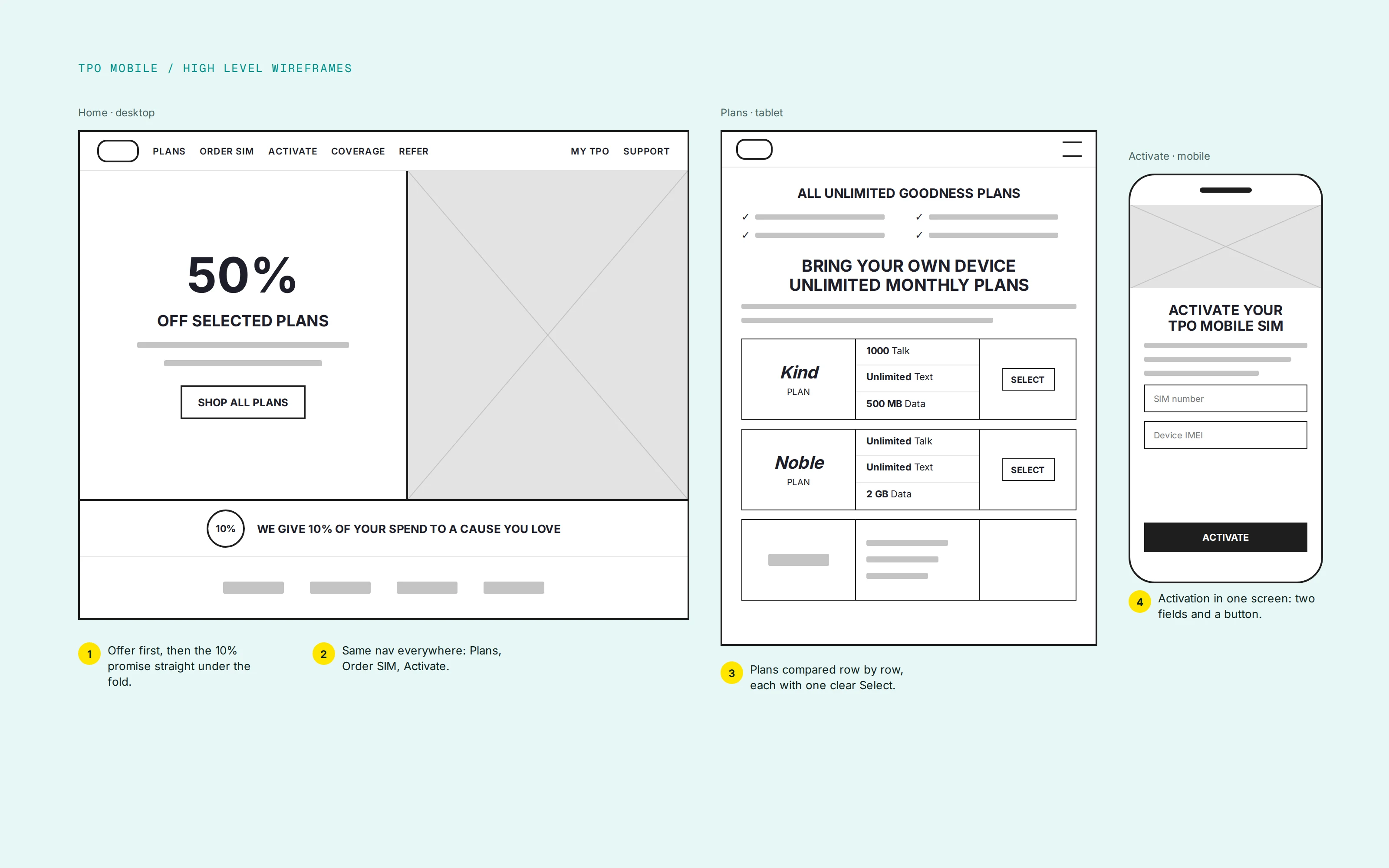
I wireframed the storefront and tested prototypes with real people. Then I designed it with the CEO and Iris Worldwide, from soft launch to full rollout.
04 · Sketch, then build · high level wireframes
04 The metrics
From zero
no website or brand at the start
10%
of every bill to a cause the customer chose
6
journey stages designed end to end
2016
US launch
05 The solution
Purpose front and centre.
A purpose led storefront and self service platform covering sign up, plans, billing, payment and account management. The brand work filtered back into the UK.
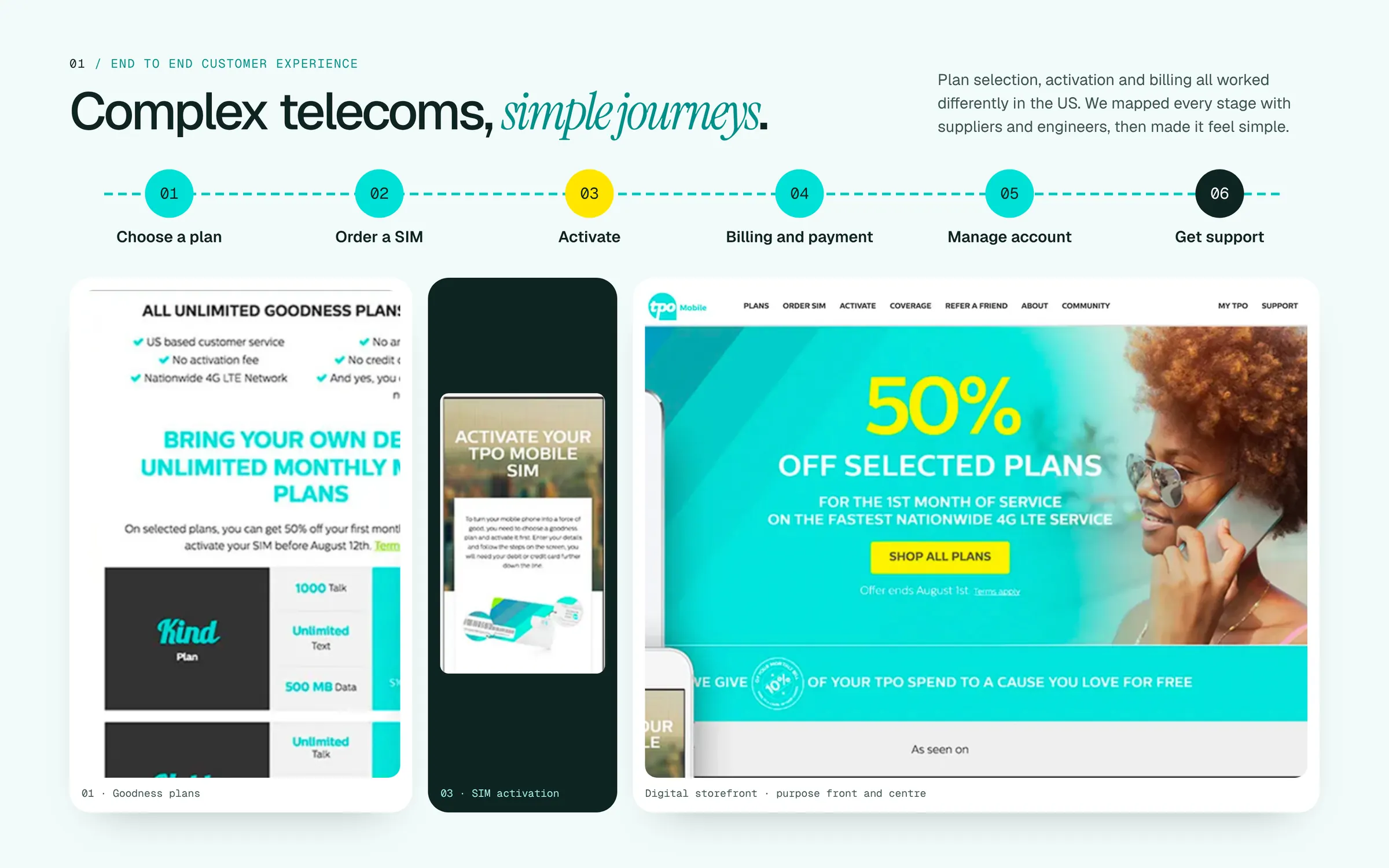
TPO launched in North America, winning customers on price and offer.
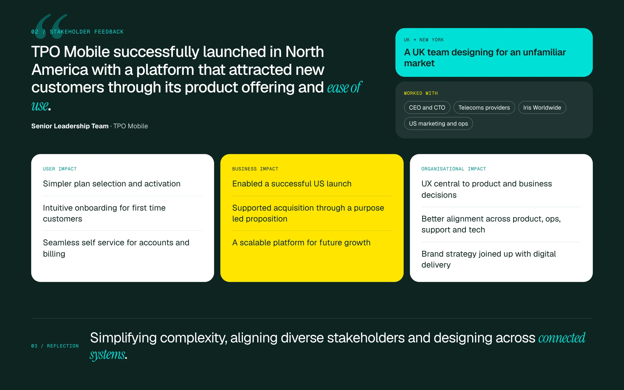
“Sam and his team worked tirelessly to ensure every touch point was considered, every user was thought of and every level of detail was met.”
Senior Leadership Team, TPO Mobile
Next case study
Cancha